(+48) 508 425 378
 office@bitpeak.pl


Introduction
This is the second article in our series about Environmental, Social, and Governance (ESG), a topic which is becoming increasingly more and more important both legally and economically. In part one of the series, we described what ESG is, why it is important, and what are current regulations. We highly recommend the read!
This time we would like to dive deeper into reporting aspects of ESG and explain why we think Microsoft Power BI together with Fabric ecosystem are the best options to both fulfil all the requirements and gain additional value and advantage over the competition. We will show an example of GRI standards compliant Power BI report and describe design choices, benefits of such a solution, and also possible enhancements like AI talking with data behind the report.
Business Intelligence…
Business Intelligence (BI) can be defined as a set of practices and tools allowing businesses to manage their data and analyze it for the benefit of the whole organization. Introducing BI can generate value in various ways like automating labor-intensive data-related tasks, standardizing reporting processes, granting observability for core company’s operations, enhancing decision making, and many more. Together with data governance, BI can bring order to your data assets and allow you to discover and focus on what are foundational metrics that drive your business.
Power BI allows organizations to easily connect to data from various sources, transform it, build data models, and create all possible metrics. This metrics layer built on top of a data model is known as a semantic layer – here business logic is superimposed on the data. Recent research papers (link) show that the semantic layer might be a crucial factor for AI to deliver precise answers and minimize hallucinations. Models built in Power BI can be scaled to enterprise level, and all the metrics can be presented on reports, furtherly enriching the whole solution by using best data visualization practices. As part of Microsoft Fabric (AI-powered analytics platform) and seamless integration with Power Platform (business applications), Power BI can fulfill almost any business need.
With addition of MS Fabric, Power BI is now part of a data platform based on modern Lakehouse architecture, with an integrated storage layer called OneLake and multiple workflows including data engineering, data science, and real-time intelligence. With such a setup Power BI can consume best quality, well-governed data from almost any source. It is also worth noting that any part of this platform will be integrated with AI, able to handle most of the repetitive tasks, significantly increasing productivity.
Power Platform is a mature solution where less technical users can create business applications (Power Apps), automations (Power Automate), and AI agents (Power Virtual Agents) on top of organizational data, which can reside almost anywhere thanks to the great number of connectors. It can also reside in MS Fabrics and Power BI. This creates a situation where users can enrich organizational data in multiple ways and significantly simplify processes like approvals, alerts, surveys etc.
Before we go further, let us make sure we are all on the same page, by answering the basic question. What exactly does ESG mean?
…with ESG…
Let’s try to look at ESG reporting from a Business Intelligence perspective. It might be a challenge for many organizations to effectively create an ESG report as various data sources need to be evaluated and data needs to be collected. Depending on the size of the organization the level of complexity here may vary, from manual collection of necessary numbers in Excel, to a fully sized ETL/ELT pipeline. Data might be located outside of the organization (e.g., water or energy suppliers or companies that collect waste) or inside (financial or HR departments).
Typically, this data collection phase might be the biggest challenge, but it can be simplified with automation of data ingestion data from some sources can be ingested directly by Power BI (e.g., with CSV/Excel files or via API), through Power Apps, or by using data engineering pipelines. With data in place, a work on fully automated, interactive reporting solution can start.
Recently at BitPeak, we created a GRI-compliant ESG report (link) and we will use it as an example. GRI stands for Global Reporting Initiative – an organization that creates standards that can serve as a framework to report on business impacts, including the ones in the scope of ESG (link).
It is worth noting that GRI standards are international and widely adopted across companies (78% of 250 biggest global companies adopted those standards). European Union used GRI standards and other frameworks to create ESRS European Sustainability Reporting Standards, which are used by large companies in the EU to report on their ESG goals. ESRS can be easily mapped to GRI standards which is visible in the matrix further below.
There are several categories covered by GRI standards and for each one of them, there is a set of metrics that describe it in the best possible way. In our report, we show the following categories:
- GRI 200: Economic Reporting
- GRI 300: Environmental Reporting
- GRI 400: Social Reporting
In each category, we may find both descriptive and quantitative KPIs and for our solution, we decided to choose the latter ones – for those, their progress can be easily tracked. Some examples can be found below (ESRS mapping included):
| Area | Indicator | GRI Code | ESRS code |
| ENVIRONMENT | ENERGY CONSUMPTION | 302-1 | ESRS E1 E1-5 §37; §38; §AR 32 (a), (c), (e) and (f) (some differences in how data is aggregated/disaggregated) |
| ENVIRONMENT | WATER USAGE AND WITHDRAWALS | 303-5 | ESRS E3 E3-4 §28 (a), (b), (d) and (e) |
| ENVIRONMENT | GREENHOUSE GAS EMISSIONS | 305-1 | ESRS E1 E1-4 §34 (c); E1-6 §44 (a); §46; §50; §AR 25 (b) and (c); §AR 39 (a) to (d); §AR 40; AR §43 (c) to (d) |
| ENVIRONMENT | GREENHOUSE GAS EMISSIONS | 305-2 | ESRS E1 E1-4 §34 (c); E1-6 §44 (b); §46; §49; §50; §AR 25 (b) and (c); §AR 39 (a) to (d); §AR 40; §AR 45 (a), (c), (d), and (f) |
| ENVIRONMENT | GREENHOUSE GAS EMISSIONS | 305-3 | ESRS E1 E1-4 §34 (c); E1-6 §44 (c); §51; §AR 25 (b) and (c); §AR 39 (a) to (d); §AR 46 (a) (i) to (k) |
| ENVIRONMENT | EMISSIONS OF AIR POLLUTANTS | 305-4 | ESRS E1 E1-6 §53; §54; §AR 39 (c); §AR 53 (a) |
| ENVIRONMENT | WASTE GENERATION AND DISPOSAL | 306-3 | ESRS E5 E5-5 §37 (a), §38 to §40 |
| ETHICS | RISK CORRUPTION ANALYSIS | 205-1 | ESRS G1 G1-3 §AR 5 |
| ETHICS | REPORTED CASES OF CORRUPTION | 205-3 | ESRS G1 G1-4 §25 |
| ETHICS | LEGAL ACTIONS TAKEN | 206-1 | Not covered |
| ETHICS | CUSTOMER PRIVACY BREACHES | 418-1 | ESRS S4 S4-3 §AR 23; S4-4 §35 |
| LABOR & HUMAN RIGHTS | EMPLOYEE TURNOVER RATE | 401-1 | ESRS S1 S1-6 §50 (c) |
| LABOR & HUMAN RIGHTS | OCCUPATIONAL HEALTH AND SAFETY INCIDENTS | 403-9 | ESRS S1 S1-4, §38 (a); S1-14 §88 (b) and (c); §AR 82 |
| LABOR & HUMAN RIGHTS | TRAINING AND DEVELOPMENT HOURS | 404-1 | ESRS S1 S1-13 §83 (b) and §84 |
| LABOR & HUMAN RIGHTS | DIVERSITY IN THE WORKFORCE | 405-1 | ESRS 2 GOV-1 §21 (d); ESRS S1 S1-6 §50 (a); S1-9 §66 (a) to (b); S1-12 §79 |
| LABOR & HUMAN RIGHTS | NON-DISCRIMINATION INCIDENTS | 406-1 | ESRS S1 S1-17 §97, §103 (a), §AR 103 |
| SUPPLY CHAIN | PERCENTAGE OF LOCAL SUPPLIERS | 204-1 | Coveredy by MDR-P, MDR-A, MDR-T |
| SUPPLY CHAIN | SUPPLIER ASSESSMENTS FOR SOCIAL AND ENVIRONMENTAL PRACTICES | 414-1 | ESRS G1 G1-2 §15 (b) |
… and Power BI!
It is worth noting that creating a report with specific branding in mind is always welcome. With Power BI it is possible to add company logo, photos, or animations to report pages and apply required colors or patterns to multiple objects and charts. For our report, we aligned with color guidelines applicable to our company. We also tried to mimic the website design by using specific shapes and fonts, so the report looks coherent and can be immediately associated with our brand.
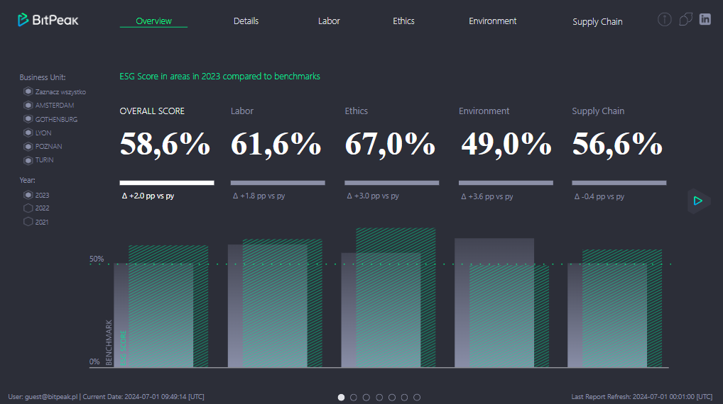
As visible above, the report has a clean design and an easy-to-follow structure. At the top we can see the company’s logo and navigation menu starting with the “Overview” page. As it is the first page that users see, we followed the helicopter’s view approach, where most top-level metrics can be analyzed with a glance of an eye. A user can then filter this page using the slicers on the left. In case a more granular access is needed, row-level security can also be applied – some users would see everything while others only slice of the data. We decided to use scores as a top-level KPIs – they could be either calculated using the company’s internal logic or by external auditors. In case the audience needs more detailed information, they can move on to either the details page, being a granular view, or to the specific domain page to find answers.
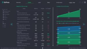
On “Details” page we present a matrix with a list of KPIs that correspond to score values. Targets set up by the leadership are also added, so that it is evident to users that some metrics needs to be furtherly evaluated. Area charts showing changes of scores in time, can help to distinguish if situation is improving or not. Depending on requirements the matrix can be modified to show the difference between the current and previous year, a drill-through option can also be added to make this page even more useful.
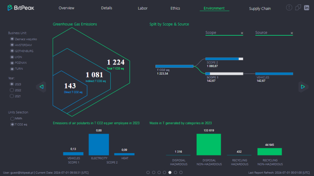
Pages “Labor”, “Ethics”, “Environment”, and “Supply Chain” dive deeper into each category’s nuances. Again, we apply our company’s branding elements to create a familiar experience for our business users. It is important to remember that the report’s audience can consist of users that are not really fluent in reading charts and graphs, so on each page we try to use simple, but the most effective data visualizations, so that all the metrics can be easily interpreted. The decomposition tree is a fine example of a simple visual that can bring a lot of value to users, due to the fact that it allows them to easily explore data in various ways.
Potential improvements
Typically, BI projects are not static or one-time efforts. Usually after the evaluation period some adjustments are required, new functionalities are needed, and the whole solution grows. Therefore, let’s try to imagine how to leverage available technical options to enrich our report:
Breaking data silos
It is always worth looking at the reporting solution as a part of a bigger analytics architecture. ESG reporting can be integrated with finance, HR, or production reporting so that we can break data silos and see the whole picture. Insights coming from the ESG report can improve multiple business areas such as sustainability, employee wellbeing, or risk management. With all the company’s departments having a clear view of ESG goals, joint effort to reduce some of the impacts can be taken.
Action on data:
Power Platform
Addition of Power Apps and Power Automate can turn our modest report into robust business solution. Data validation can be easily added to the report’s canvas along with comments and data write-back. Certain actions can be triggered from the report itself including approvals, sending notifications, even implementing complex logic with Azure Functions or Logic Apps.
Data Activator (Fabric only)
If our data is stored in Microsoft Fabric then we have several new options to use. The first one to mention is Data Activator – a brand new workflow to monitor data and create alerts. It allows automation of the metric checks with highly customizable settings. Users can apply specific rules to alerts and can choose different ways to being notified (e.g., via email or Teams). What is important, is a low-code option so no coding skills are needed to use it.
Microsoft Copilot (Fabric only)
A very hot topic at the moment is using AI on your data. What Microsoft proposes is Copilot, an umbrella term to describe several AI agents that help users with tedious tasks. At the moment Copilot is available in multiple Fabric workflows. But for us, the most exciting one is the one that can work with Power BI’s semantic model and answer business questions. Earlier Q&A visual could do a similar thing but with the introduction of LLMs, it is a leap forward to deliver a more sophisticated solution.
Diamond Layer (Fabric only)
In Fabric, it is possible to connect to Power BI’s semantic model with a newly-created Python library called SemPy. Data stored in semantic models is especially valuable as it is clean, curated, and business logic is already incorporated here. That’s why it is sometimes called a “diamond layer” in medallion architecture. The option to connect directly to the model is called a Semantic Link and it opens tons of possibilities for users with coding skills. Data science workflows, data validation and QA or even model development can be done using this library.
Summary
The marriage of ESG and business intelligence can bring a lot of value to organizations. Reporting solution which grants observability and delivers actionable insights is the most visible outcome, but several equally important processes like evaluation of useful data sources, building scalable data pipelines, bringing data governance and establishing proper data culture take place allowing the company to grow and flourish.
If you would like to know more about how BitPeak can leverage your data estate to deliver enterprise-scale ESG solutions do not hesitate to contact Emil Janik, Head of Data Insights at BitPeak.
All content in this blog is created exclusively by technical experts specializing in Data Consulting, Data Insight, Data Engineering, and Data Science. Our aim is purely educational, providing valuable insights without marketing intent.